 Boot up Diablo II: Resurrected on a large monitor or TV, and one thing becomes obvious fast. The items don’t just look good; they’re also functional. They look meant to be seen big. Swords feel heavy. Armor reads clearly at a glance. Even small charms carry visual weight. At the core of D2R items design is shape. Every weapon and armor piece has a strong silhouette that reads instantly, even from a distance. You don’t need to zoom in to tell a flail from a mace or a kite shield from a tower shield. The forms are exaggerated just enough to be readable on a large screen without becoming cartoonish.
This matters because Diablo II was never about staring at one item in isolation. You’re constantly moving, swapping gear, scanning drops on the ground. On a big screen, thin details blur, but strong shapes survive. D2R’s items lean into that reality. They prioritize clarity over ornamentation.
Texture work that scales up cleanly
The remaster’s textures were rebuilt with high resolution in mind, but they avoid the trap of hyper-detail. Instead of filling surfaces with noise, the artists used broad material cues: worn leather, pitted steel, chipped bone. These textures hold up whether you’re sitting two feet from a monitor or ten feet from a TV.
On a large display, overly busy textures can turn muddy. D2R avoids that by keeping contrast controlled. Highlights are intentional. Shadows are deep. The result is gear that feels tactile without becoming visually exhausting.
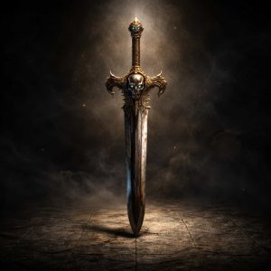
Lighting that frames items like props
Lighting does a lot of heavy lifting. Items in D2R are lit as if they’re physical objects placed on a stage. Edges catch light. Metallic surfaces reflect softly. Gems glow just enough to pull your eye.
This approach makes items feel substantial, especially on larger screens where lighting effects have more room to breathe. A unique sword isn’t just brighter. It’s presented. The lighting guides your attention, just as a film prop is lit to stand out in a scene.
Color choices that respect distance
D2R’s color palette is restrained. Most base items live in earthy tones: browns, grays, muted reds. When color shows up, it means something. Blue items lean cool and clean. Rare items use gold accents sparingly. Unique items often introduce a single dominant hue.
On a big screen, this restraint pays off. Colors don’t bleed into each other. Item types remain distinct even in a cluttered inventory. You can spot value without reading text, which is critical when you’re playing from a couch instead of a desk.
Inventory as a visual grid, not a list
The classic grid-based inventory might seem dated, but it’s surprisingly well-suited for large displays. Items occupy physical space. A polearm looks big because it takes up more squares. A ring feels small because it should.
On a big screen, this spatial logic is easy to read. You’re not parsing rows of icons. You’re arranging objects. That physicality makes the inventory feel more like a table laid out with gear than a menu buried in UI.
An animation that reinforces weight
When you equip an item, it doesn’t snap on instantly. There’s a slight pause. A subtle motion. Shields settle into place. Weapons shift the character’s stance. These animations are understated, but on a large screen, they matter.
They sell the idea that items have mass. That a new piece of armor changes how your character exists in the world. Big screens amplify motion, and D2R uses that to make gear feel consequential.
A legacy of pre-HD design thinking
Ironically, part of why D2R works so well on large displays is its age. The original Diablo II was designed for low resolutions, where clarity was everything. Icons had to read at 800×600. Colors had to separate cleanly. Shapes had to communicate fast.
The remaster keeps that philosophy intact. It doesn’t try to modernize items into tiny, hyper-detailed icons. Instead, it scales up the original intent. That old-school clarity translates beautifully to modern, oversized screens.
Items as visual rewards, not just stats
Finally, D2R understands that items are emotional rewards. When something drops, it should feel important. On a big screen, that feeling is amplified. A glowing, unique item on the ground isn’t just loot. It’s a moment.
The design supports that. Drops are readable. Visual cues are strong. You don’t miss the good stuff because it got lost in visual noise. The screen gives items room to command attention.
The takeaway
D2R items look designed for the big screen because, in many ways, they are. Strong silhouettes, controlled textures, thoughtful lighting, and precise color language all work together to make gear readable, weighty, and satisfying at scale. The game doesn’t fight large displays. It embraces them.
That balance, between old-school clarity and modern presentation, is why D2R’s items don’t just survive on big screens. They thrive.